Overview
Our symbol is derived directly from our wordmark. It is bold and scales perfectly for all use cases.

Symbol
Spacing & sizing
Symbol sizing
Our symbol can become as small as possible as long as it remains legible.

Our symbol can also scale up infinitely, specifically when physically printed.
Symbol clearspace
To preserve the integrity and legibility of our symbol, ensure there is always adequate clearspace between it and other elements or boundaries of the space it occupies.
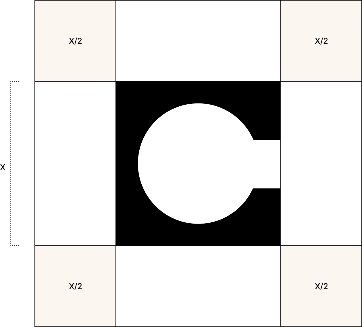
X is half the height of the symbol.
A margin equivalent to 1/2 of x should never contain any other design elements.
Do’s and don’ts
Symbol do’s
To preserve the integrity and legibility of our symbol, ensure there is always adequate clearspace between it and other elements or boundaries of the space it occupies.

Onyx on Prosperity Yellow

Gypsum or Snow on Forest

Onyx on Gypsum

Gypsum on Wood

Snow on Fig

Onyx on Snow

Snow on Onyx

Prosperity Yellow on Photography
Symbol don’ts
Below are examples of how not to treat the symbol.

Do not use unapproved colors for symbol.

Do not distort the symbol.

Do not rotate the symbol.

Do not add any effects to the symbol.

Do not outline the symbol.

Do not round the corners of the symbol.
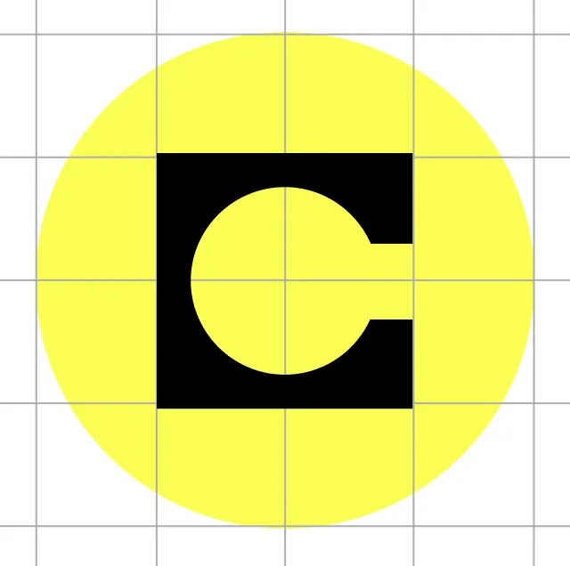
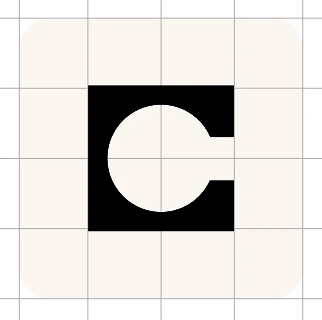
Symbol placement
For digital avatars for our social channels, we opt for our symbol placed in Onyx over a Prosperity Yellow or Gypsum circle or square. See the guidelines below for placement and scale.
Usage

Digital avatar in email

Digital avatar in social